

 Follow us on LinkedIn
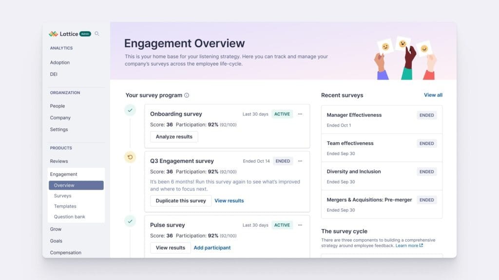
A People Ops dashboard is a single, visual home base for the numbers that tell you how your workforce is actually doing in terms of:
- Turnover
- Time to hire
- Engagement scores
- Absenteeism
- Headcount
- Etc.
All pulled together in one place instead of scattered across spreadsheets, HRIS exports, and someone's memory.
Instead of digging through five different systems every time leadership asks "how's retention looking this quarter," you pull up one screen and there's your answer, usually with a chart attached.
 Teresa Garanhel
Why People Ops leaders can't ignore this in 2026
Most HR/People teams aren't short on data; they have too much of it. The real problem is timing: the numbers exist, but by the time someone assembles them into a report, the moment where a manager could've actually intervened has already slipped by.
That tension is exactly what's driving so much of the current conversation around workforce analytics.
Reports built around headcount, engagement scores, performance results, and exit interview summaries stacked quarter over quarter are useful for looking backward, but they don't help you get ahead of anything.
A modern dashboard connects directly to priorities that matter to leadership: controlling labor costs through reduced turnover and optimized hiring, boosting productivity per employee through engagement, demonstrating real progress on diversity commitments, and minimizing the loss of top performers.
The numbers behind that last priority make the case for urgency on their own. Gallup estimates voluntary departures cost U.S. businesses roughly $1 trillion a year, with replacement costs typically running half to twice a departing employee's annual salary.
And according to the Work Institute's Retention Report, roughly 75% of those voluntary exits were preventable, which is exactly the kind of insight a well-built dashboard is supposed to surface before it's too late.
There's a quieter risk sitting underneath the calmer headline numbers, too. Gallup's data found 51% of workers were actively looking or watching for new roles even while quit rates stayed low, suggesting a lot of that stability is really just pent-up turnover waiting for the job market to loosen up.
A dashboard that only tracks who's already left misses that entire population of quietly disengaged employees who haven't walked out the door yet.
The metrics that actually belong on your dashboard
As we said, not every number deserves a spot on your dashboard. Cram in everything your HRIS can spit out, and you'll end up with something so cluttered nobody uses it.
A solid starting shortlist:
- Turnover and regrettable turnover, broken out by department, manager, and tenure band, not just one company-wide number.
- Time to hire and time to fill, since a slow pipeline drags on productivity and morale for the team waiting on that headcount.
- Engagement and eNPS trends, tracked often enough to catch a dip before it becomes an exodus.
- Absenteeism and burnout indicators, which often show up before someone actually resigns.
- DE&I representation data, granular enough to show real movement rather than a company average that hides what's happening team by team.
 Teresa Garanhel
What this looks like inside real companies
It's one thing to talk about dashboards in the abstract, and another to see how companies actually put them to work.
Google has its own People Analytics team, and the company publishes a fair amount of its thinking directly through Google re:Work, its own site for sharing how it runs people programs.
One thing Google says shaped this team from the start: rather than beginning with fancy forecasting tools, the team focused first on understanding the actual people problems worth solving, and only then figured out what data and metrics would answer them.
Google's own guidance is blunt about the trap most teams fall into: “it's tempting to start with the data you already have rather than the data you actually need”, so the discipline is to work backward from a real business question instead of leading with whatever numbers are lying around.
That “start with the question, not the spreadsheet” approach is the throughline in nearly everything Google publishes about how its People Analytics function operates.
Tampa General Hospital
Tampa General Hospital is a strong, current example of what a dashboard-driven approach to workforce data can actually deliver.
Recognized with Visier's 2025 Business Impact Award, the hospital used data to drive smarter staffing decisions, moving from relying on more than 300 outside staffing agencies down to zero inpatient travel nurses, while bringing its vacancy ratio below 10%.
The savings from that shift didn't just disappear into the budget, either. The hospital reinvested them into raising base pay for its own team members over the following two years, which in turn helped boost retention and rehire rates.
That's a rare, concrete example of a workforce dashboard driving a decision that shows up in both the retention numbers and the compensation budget.
ADP
ADP shares aggregated, ongoing results from its own DataCloud customers directly on its site, and the numbers are specific.
Half of organizations using its time-to-fill metrics cut their average time to hire by 27 days, 60% of organizations using its turnover cost storyboard lowered their voluntary turnover costs, and more than 55% of those tracking overtime metrics reduced overtime costs.
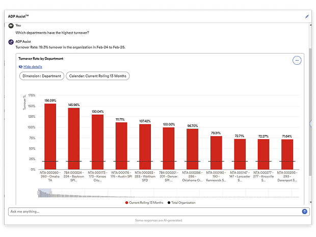
From static reporting to real-time decision-making
There's a meaningful difference between a report and a dashboard, even though people use the words interchangeably.
Most organizations, if they're honest, are still stuck closer to the report end of that spectrum. HR analytics has moved from purely descriptive dashboards towards predictive analytics, but many teams still don’t operate like that.
Getting past that means moving from “what happened” to “what's likely to happen, and what should we do about it,” using data analysis to spot patterns in HR activity and estimate the probability of events like turnover or internal mobility.
Ideally, this is done close to real time wherever possible.
This is also where AI-driven narrative tools are starting to change the game. Rather than just displaying charts, some 2026-era platforms translate complex data into plain human language and actionable summaries.
Engineering attrition nearly doubled this quarter, driven almost entirely by voluntary exits on the platform team (5 of 7 departures).
Exit interviews cite 'lack of career progression' as the top reason, up from a minor factor last quarter. This coincides with the platform team going 6 months without a promotion cycle, while other engineering teams promoted normally.
Recommended action: review the platform team's promotion pipeline before the next engagement survey, since two more employees on that team scored in the 'flight risk' band this month.
Common mistakes People Ops teams make when building dashboards
It's worth being honest about where this goes wrong, because it goes wrong often. Only about 8% of organizations rate their HR and talent operational reporting capabilities as excellent, while a majority (53%) describe them as weak.
The pattern repeats in longer-term planning. For multi-year workforce planning specifically, again only 8% rate themselves as excellent, with 51% landing in the weak category.
Usually the underlying issues are mundane, not mysterious. When teams attempt to measure everything and push it up the chain, they typically wind up with dashboards nobody has confidence in, numbers that are stale before anyone even looks at them, and a persistent suspicion that something in the data is off.
Choosing the right People Ops dashboard software
There's no shortage of platforms promising to solve this for you, and the market's only gotten more crowded.
The most effective people analytics platforms combine solid operational workforce reporting with tools that help you understand employee experience and behavior in real time. For instance:
- Predictive analytics,
- Employee listening tools,
- Sentiment analysis,
- Manager self-service capabilities, and
- Integrations with your HRIS, collaboration, and engagement platforms.
Compliance is worth building into your evaluation checklist too. With labor law enforcement tightening, compliance has stopped being a checklist item and become a real-time dashboard metric.
Before you go shopping for a new tool, it's also worth remembering that knowing the different types of data analytics and how to crunch the numbers matters, but the quality of the underlying data matters even more.
A beautifully designed dashboard built on bad data will still lead you to the wrong conclusions.
A quick, practical checklist worth running through before you commit to any vendor:
- Can managers actually reach their own team's data without filing a request to HR every time?
- Does the platform translate raw numbers into plain language, or just hand you another chart to decode?
- How well does it integrate with your existing payroll, survey, and applicant tracking systems?
- Does it support the compliance reporting you genuinely need for the regions you operate in?
- Can it scale with you, or will you outgrow it in eighteen months?
 Teresa Garanhel
TL;DR
A People Ops dashboard isn't just a fancier way to look at the same old HR reports.
You should see it as a genuine shift in how people leaders make decisions, moving away from backward-looking summaries and toward something you can act on in the moment.
Get your fundamentals right, and the dashboard stops being a reporting tool and starts being what it should've been all along: the thing that helps you spot a problem while there's still time to fix it.
Become an Insider member to access ready-to-use templates and exclusive content aimed at making your life 1,000x easier.
 People Alliance